
Home » 2013 (Page 2)
Yearly Archives: 2013
Yield Trek: Into Darkness, Part 2
“Random chance seems to have operated in our favor” — Spock
“In plain, non-Vulcan English, we’ve been lucky” — McCoy
“I believe I said that, Doctor” — Spock
The data shows that there have been large inflows of cash to yield bearing equity strategies. That is not enough to get worried. What I’d like to see before shorting is 1) elevated prices & valuations, 2) an illusion of safety, 3) feedback loops, 4) diminishing ability to put cash to work and 5) a catalyst. Fortunately, we are able to see all of these things in this yield trade.
Valuation: danger ahead for REITs
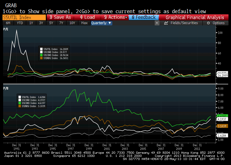
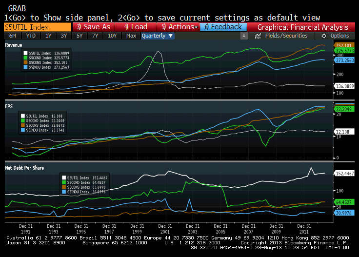
I first look at the data for non-REIT companies. Above is a chart showing price-to-earnings (P/E) and price-to-book (P/B) data for 4 heavily weighted dividend sectors. Those sectors are: utilities, consumer discretionary, consumer staples and industrials. These are GICS sectors and the data is from Bloomberg. The utilities P/B ratio is quite high. Bluntly, P/E ratios look relatively normal. However, take a look at the next graph showing revenue, earnings per share (EPS) and debt per share. Note:
1) consumer discretionary revenues have not caught up to pre-2008 highs, but EPS is significantly higher
2) revenue and EPS are higher for consumer staples, but debt/share is growing and is double pre-2000 levels
3) despite languishing revenue and EPS, utilities debt/share are at all-time highs
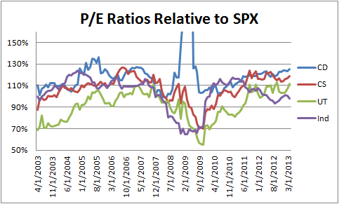
I’ve included another graph showing P/E ratios relative to the SPX P/E. Other than industrials, all of these four sectors look, at least, slightly rich. Utilities, in particular, looks very expensive compared to alternatives in the market. Overall, it looks clear that investors are overpaying for sectors considered to be dividend payers though not necessarily at nosebleed prices. Utilities valuations and debt burdens are showing definite warnings signs and should be avoided, or used as a candidate for the short side of sector pair trading.
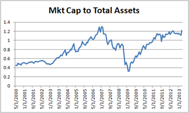
REITs are a different story. I’ve kept them separate because they use a different profitability metric, P/FFO. The data for this article is from Bloomberg and I was unable to get historical FFO data for the S&P REIT Index directly. Instead I took 5 major REITs (BXP, AVB, SPG, KIM, VNO) and aggregated the data. I took simple averages of their P/FFO ratios; not all series went back to 2003 but the latest started 2005. As can be easily seen, on both absolute and relative bases, REITs are at their highest profitability ratios in the last 10 years including during the real estate bubble.

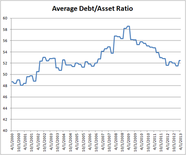
On the surface, it seems as though REITs have cleaned up their debt act a bit since 07/08. However, the reason for the peak of the debt/asset ratio in 2009 was due to the precipitous decline in the value of assets. Now with assets stabilized and even increasing, REITs have increased their debts so that the ratio is back to pre-crisis highs. In addition, the market is giving them an extremely generous market valuation for those assets. Market capitalization, for at least those major 5 REITs, is right back to pre-crisis, i.e., bubble level, highs. REITs are squarely in the danger zone based on valuation.
Illusion of Safety
With the exception of high yield bonds and, possibly, MLPs, dividend and low volatility strategies are touted as being safe (for example, here or here). But the safety that is being offered is measured using the rear-view mirror. Safety is being judged based on past performance – which we know is not a guarantee of future results. Measuring risk based on historical asset movements has three major flaws. The first is that it is measuring movement, not risk. For example, standard deviation does not differentiate between assets bouncing around and an earnings release that qualitatively changes a company outlook. Second, it does not account for asymmetric risk. Option positions are one type of asymmetric risk; buying an asset very cheaply or paying too high a price is another. Third, it creates feedback loops when large amounts of money move based on the same criteria. Low volatility invites larger asset purchases, particularly with leverage. This decreases realized volatility as prices move up which again invites larger purchases. Once inflows inevitably stop, volatility increases, causing risk reduction or margin calls as exposures must be managed based on newly assessed risk outlooks.
Low-volatility investing works by measuring prior period asset movement, much as Value-at-Risk (VaR) does. SPLV, the largest low volatility ETF, bases its holdings on realized volatility over the prior 12 months and rebalances quarterly. The nice thing about low volatility asset management is that it is based on solid empirical data. That’s good except for the part about how the data that was used for the studies did not count on large amounts of money following the same strategy. SPLV does not count on anything else other than qualifying as the 100 stocks out of the SPX with the lowest realized volatility. These assets tend to look like traditional dividend players – and heavy on REITs (10% for SPLV, less for others). If these holdings begin to get volatile, they will be forced to evict them from the portfolio which will then contribute to greater volatility.
Feedback Loops & Diminishing Ability to Buy More
In addition to the volatility based feedback discussed in the section above, there are other feedback loops at play:
1) Margin debt. Discussed here, note that the most recent release which was subsequent to that post, showed margin debt climbing to an all-time high.
2) High levels of bond funds holding equities. Discussed here.
3) Risk parity and similar strategies. Discussed in part 1.
4) Abenomics leads to Yen devaluation and Japanese “exporting” deflation. here and here. With Yen depreciation at least temporarily slowed, expect Japanese money to REITs to slow or stop.
5) One of the most interesting feedback loops also comes from Japan, where they, too are searching for high yield. In the Heard on the Street column from April 15, 2013, it was reported that Japanese investors have been searching for yield in vehicles that invest in US REITs. The key part is that they pay out unrealized (not a typo, unrealized) capital gains on the way up as dividends. That is amazing. One can only imagine the debacle if US REITs stop climbing. Oh yeah, and they are large holders of these stocks, too. According to the article, they own 8.6% of SPG and 10.1% of VNO. For those of you that remember chemistry class, this reminds me of a super-saturated, barely stable solution ready to blow (think Diet Coke & Mentos).
Catalyst
This is the toughest part about investing. Even if one presumes enough to believe that one has the correct analysis, it is no good to be too early (e.g., Abnormal Returns from 2011). What might be a catalyst could turn out to be a bump in the road. That said, I believe that we have seen the catalysts to shake things up. First, FX market volatility has picked up. After hitting multi-year lows at the end of 2012, the JP Morgan global FX volatility index has rebounded to 2010-2011 levels. This is due to Yen weakening. Second, that volatility has spilled over into commodity markets, most noticeably gold & silver. I consider this to be a canary in the coal mine. Finally, the potential for the Fed to slow or stop purchases in the mortgage markets will have a huge impact on volatility and asset prices. Fixed income prices have begun to re-price the possibility of this and it has sent 10 year note yields to their highest level since beginning of 2012 in just a few sessions. Recall too that the Fed effectively sells volatility by buying mortgage paper (there is an embedded pre-payment option).
Conclusion
All well and good, but what is the elevator speech? Too much money, most seemingly leveraged money, is chasing the latest investment craze – yield in dividend stocks. The most distended market is for REITs which looks particularly expensive by benchmark measures. Further, the investor class in REITs is a large set of “weak hands.” That is, they are investors who will need to exit (due to margin calls or structural investment guidelines) at the first sign of trouble and they are too large a proportion of owners to make the exit orderly. While other areas of dividend investing may look rich, REITs are where the focus should be for short ideas. The time is soon approaching when this will occur – already some volatility has been creeping into REIT shares and ETFs. It is hard to imagine that continued inflows will recur. And once the support for an overvalued asset stops, the decline can begin.
The Fed, the Shadow Banking System and the Law of Unintended Consequences
Andy Kessler writes on the opinion page of the Wall Street Journal about Fed policy, collateral and the shadow banking system. This is definitely an inside baseball type story. But this is a case where the detail work makes a big difference to the big picture. The quick version is that banks use high quality collateral, i.e., government and mortgage debt, to create credit. They do this by re-hypothecation in the repo (repurchase agreement market). His point is to criticize Fed policy, presumably with the idea of “correcting” it. If he is correct, and I think that he is at least partially correct, then the immediate implications are far more interesting than a critique of Fed policy.
First, here is a bit of background. A repo is nothing more than a collateralized loan. For example, I purchase a 10 year note and want to finance it. The cheapest way to do so is in the repo market where I post the note as collateral. It is called a repurchase agreement because rather than create a loan, I simultaneously sell the note to the bank and negotiate a forward “repurchase” of it. Voila. The bank is happy because it has a liquid asset backing its loan (not like a house) and it has a very good handle on its value. Plus it demands the loan be over-collateralized. I’m happy because I’m getting an extremely good rate due to the safety of the loan.
The bank now has a 10 year note on its balance sheet. Banks don’t like to waste balance sheet; they get measured on their efficient use of it. So the bank does a repo with the 10 year note from me. Now they have the cash, minus the overcollateralization amounts. Bam! Money created. That process is called re-hypothecation (simply because the original loan is called hypothecation. Fortunately, the next transaction is still called re-hypothecation and not re-re-hypothecation.).
Before anyone lays down judgment on how this shows how banks shouldn’t be able to create out of control fiat credit, please realize I’m reporting what happens. I’m not interested right now in whether it is a good idea or not.
The first question is whether he is correct. There is no doubt that the Fed is buying truckloads of bonds. This article from Bloomberg in December estimates that the Fed will be the buyer of 90% of new dollar denominated assets. The Fed focuses on the highest quality (most credit worthy and liquid) issues, i.e., government and mortgage debt. So there clearly is a critically small amount of issuance available. Further, this IMF paper documents the re-hypothecation in the banking system.
To review: 1) The Fed’s QE policy is reducing the amount of usable collateral for hypothecation, 2) this collateral is critical for the “shadow” banking sector, and 3) the “shadow” banking sector is a larger credit creation mechanism than the Fed’s QE. The Fed has stated that its goal is to keep QE going until economic growth gains momentum. Based on this analysis, the clear conclusion is that right as the Fed wants to unwind QE to take the pedal off of the gas, collateral will become available and the credit creation from the shadow banking system will kick in. The implication is that the Fed will have trouble keeping credit creation under control and that inflation will become a real risk.
Yield Trek: Into Darkness Part 1
“Mr. Spock, the women on your planet are logical. That’s the only planet in the galaxy that can make that claim.” – Captain Kirk
This post has taken far longer for me to put together than I had anticipated. I spent quite a bit of time putting together the data and moving down paths that didn’t work. It is also taking more text & space than I had anticipated. Therefore I am splitting this into multiple posts. This first post covers the explosion of assets in yield bearing equities. One last editorial note, substitute “investors” for women in the quote above.
In at least on respect, FED policy is working: QE via its bond buying program is forcing investors up the risk curve. And that is making for an unintentionally very over-crowded trade. This is because multiple trends are coming together into the same or similar assets due to investors’ search for yield and safety. It is the natural reaction investors have to getting burned twice before reaching for capital gains: first in 2000 with dotcoms and in 2008 in real estate. Rather than seek capital gains, they are trying to play it safe by being content to collect dividends. But investors are paying high prices for small cash flows and the quest for yield is playing out in bulk. If this plays out as another crash as I expect it will, the irony will be that investors were trying to be conservative.
Here are some of the trends:
– Dividend stocks
– REITs
– MLPs
– Preferred stocks
– Low-volatility investing
– Risk parity investing
– Yen depreciation
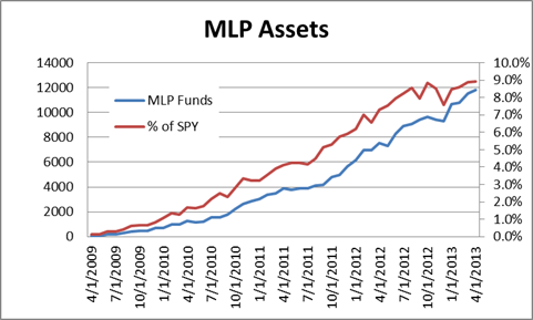
It’s easy to see how a quest for yield leads investors to these first four sectors of the stock market. Even bond investors seem to be getting into the act. There is an enormous amount of money chasing these sectors and the data to support that follows. First, consider dividend paying stocks. I’ve put together data on fund assets under management (AUM) for the top 5 dividend ETFs. These account for the vast majority of dividend ETF assets. Of course, mutual fund assets are larger, but this data should capture the money flow trends. The chart shows the hockey stick growth of assets both on an absolute basis and compared to SPY assets. When looking at the percentage figures, keep in mind that SPY assets have also grown aggressively recently, having increased by over 28% in the past year and most of that, 21%, in the past 6 months. That’s not bad for a fund that a year ago had $100B.
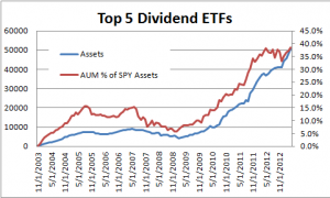
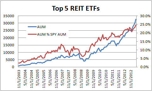
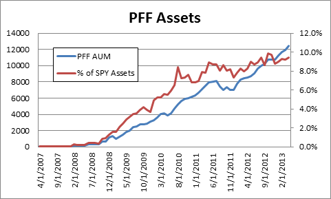
Overall, the top 5 dividend ETF assets has exploded in the past two years to over $50B (incidentally higher than that managed by GLD) – managing 4X the assets as at the end of 2010. Chart data from Bloomberg. REIT ETFs have doubled in size since the end of 2010 from a sizable asset base of $14B. PFF accounts for so much of the preferred ETF market that it is the only fund that I listed. It, too, has more than quadrupled its assets since the end of 2010. MLP assets have grown very quickly to become nearly $12B.
Clearly, an incredible amount of money has been rushed into these yield related stocks in the past two years – just in ETFs alone. But it gets more interesting. Although low volatility investing as a concept has been around for some time, it has recently become very popular. Consider that SPLV, the leading low volatility(LV) ETF, launched in May 2011 and already with over $5B in assets. SPLV’s largest competitor, USMV, was launched October 2011 and now has $3.5B. The Top 5 low volatility ETFs combined are managing $12.6B which is about 9.5% of the size of SPY. These funds have been in such demand that their assets have more than doubled this year (all 5 months of it).
Certainly there is significantly more money than this in the mutual fund complex and under non-categorized active management following low-volatility strategies. But the kicker here is that these low volatility funds look a lot like their dividend ETF competitors. First, they are very heavily weighted in the consumer (combined consumer staples & discretionary) with weightings around 20%, very comparable with dividend funds that have slightly higher concentrations in the mid-20%s and also the SPX. They have higher than SPX weightings in utilities, with dividend ETFs having a typically very heavy 10-30% (with Vanguard having 1%) and LV ETFs having between 9-30% weightings, compared with 3.3% for the SPX. LV ETFs are also very heavily weighted in real estate (including REITs). SPLV accounts for nearly half of LV ETF assets and holds 10% in real estate and the next two holding 7% and 2% respectively vs. 2% for SPX.
Another new, but prevalent trend in investing is called risk parity investing. The idea is, roughly speaking, to allocate assets in a portfolio such that each asset class’s variability (risk) is equal. For example, bonds typically have lower volatility than equities, thus the bond allocation would be levered up until the new allocation had a perceived volatility equivalent to the equity component. Each manager handles this slightly differently. But they might lever up on low volatility equity sectors to match, say, technology shares or the market as a whole. Frankly, it is beyond my capabilities at this time to provide a reasonable metric on how much money is involved in risk parity. There is an interesting discussion about it here and an article here. My feeling is that there are large amounts of assets put to work in this way, but I prefer data to feelings. Input would be very welcome.
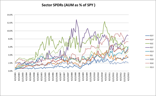
To provide a more complete picture, take a look at this next chart that shows Sector SPDR assets as a percentage of SPY assets. This shows that prior data was not documenting a secular decline in SPY assets relative to other ETFs. One can see that on a relative basis that some sectors have gathered assets and other lost. In particular, it is worth noting that the utilities sector (XLU) has seen a recent and dramatic drop in assets. This is a bit odd since utilities are the poster boy for dividend stocks. It might mean that investors wanted to diversify into a number of dividend payers, presumably for risk reduction. However, recall that utilities represent a significant part of dividend ETF portfolios and the dividend ETFs are far larger than XLU so that even that fraction (as high as 30%) can easily offset (relative) outflows from XLU.
How Much is Too Much?
“The crisis takes a much longer time coming than you think, and then it happens much faster than you would have thought, and that’s sort of exactly the Mexican story. It took forever and then it took a night.”
– Rudiger Dornbusch
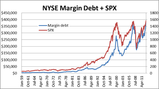
There have been some articles circulating about NYSE margin debt, e.g., here, and I think it is worthwhile to take a look at this. One response to these words of caution was that margin debt as a percentage of stock market capitalization is within a normal range. For myself, I want to put this in context. Here is some data. Note how the drop in margin debt and SPX in both 1987 and 1998 barely register. I wasn’t in the business for 87, but I can assure that the LTCM selloff in 1998 was significant in many ways.
There is a pretty nice correlation of peaks (yes, that’s the technical term) between margin debt highs and SPX highs, followed by steep drop-offs. The conclusion is clear: get short when margin debt peaks. Which leads to the equally clear problem: one can’t tell the peak until afterwards. At least for this data, we can feel comfortable about correlation meeting causation. Leveraged buyers are weak hands because their choice is limited by the margin clerk. Once prices start falling, margin selling leads to further margin selling. To address some concerns about how much margin debt is too much, I’ve created two additional charts that re-slice the numbers a bit.
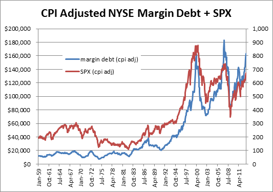
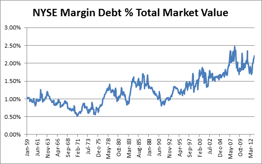
I think that the CPI adjusted margin debt adds some information as it shows that “real” margin debt is about the same as in 2000 rather than being much higher. On the other hand, looking at debt as a percentage of total market capitalization dilutes the information. It shows how the market has become more debt driven than in decades past, but it doesn’t add a red signal at any point. No danger zone for ’87, ’98, ’00, ‘07/08.
What is my conclusion here? Be afraid. Be very afraid. But these things tend to take longer to play out than one expects. In fact, the Rudiger Dornbusch quote from above captures it perfectly. Trades like this get called the widowmaker for a reason. There is evidence of weak hands playing a dangerous game. It would be great if we could find a crowded trade in overpriced assets. Yeah, and then cheap, asymmetric bets to make.
There is more to this story, but it will have to wait for the next post.
You Got Equities in my Bond Fund …
You got chocolate in my peanut butter …
I had already begun thinking that dividend stocks have become a crowded trade for some time. And then I read this article in the Wall Street Journal about how bond funds are investing in dividend paying stocks. At this point, it is an easy jump of bias confirmation to call a market top. A commenter questioned the data and I thought it would be worthwhile to investigate more. That was yesterday morning and I’m still trying to get my head around it. It is, after all, an important question. We know that yield is too expensive, that it is artificially manipulated (for our own good by all knowing central bankers) and that the (intentional) effect is to cause allocations in other areas of the economy to adjust. But how expensive? Is it an allocation or a mis-allocation? Has the search for yield become too crowded? And, most importantly, is there a trade in it?
Sorry to disappoint, but this post is only going to be a starter kit. This is a big question. It is, arguably, THE big question for investors right now.
I’ve reached out to the author of the article via email. He responded very quickly and indicated that Morningstar tracks just under 2,000 bond funds. Most funds’ allocations to stocks are small, but there are several dozen with allocations >5% and a couple dozen with allocations > 10%.
I was able to run a fund search to try to replicate the findings from the article. I also looked at the MorningStar site but didn’t find the article. I’m not a subscriber, so if you read this and are, please let me know if you find anything. Instead, I used what I have available, which is a Bloomberg terminal. I brought up the fund screening tool. The criteria that I used was: US domiciled, focus on debt asset class, USD denominated and equity fund allocation > 1%. I also only looked at primary share classes to avoid repetition of funds & assets.
According to Bloomberg’s database, there are 14,672 primary share class funds of all types active and domiciled in the US. Of those, there are 2,540 focusing on debt. Finally, of those 2540, 162 have an allocation to equities greater than 1%. 60 have an allocation greater than 5%. Like all screens, these are not perfect. Many of these look like funds that were oriented to have mixtures of fixed income and equity. Others consider preferred stocks as fixed income. Out of the top 10 for those holding more than 1% equities, 3 are Loomis Sayles. There is not an easy way to track these allocations over time, at least not in aggregate. There is nothing, therefore, to add about evolution of these equity allocations.
Overall, I don’t see a clear conclusion. I suspect that there is a reach for yield and allocations are indeed higher. The incentives in place for portfolio managers encourage a reach for yield. It seems unfortunate that there is not a smoking gun here, but sometimes finding out something is not evidently true can be as valuable as finding out that it is. At any rate, there is more to be said about the reach for yield but not tonight and not in this post.
Apple Dividend Play Follow-Up
Anyone who has never made a mistake has never tried anything new.
Albert Einstein
On April 15, I wrote an instablog post on SeekingAlpha. It explained how the forward price of a stock is impacted by its dividend and how to structure an options trade that should benefit from a higher dividend. The article went through scenarios for purchasing a conversion on Apple (AAPL) and the cash flows. As it turns out, Apple did raise its dividend. I’m going to go through the market results so far.
First, let’s review the trade and what happened. I suggested looking at Jan 2014 conversions. Mid-market was $7.03 and I wrote that it would likely cost $7.50 to get into the trade. At the time of the article, AAPL’s dividend was $2.65 per quarter. On their earnings announcement, Apple raised its dividend to $3.05 per quarter. It turned out that was below my “conservative” estimate of $3.60 based on matching the yield of other, similar tech giants. Instead, Apple’s management chose to enhance shareholder return primarily through buybacks.
It is now May 2nd. As I write this, AAPL is $447. It’s next ex-dividend date is May 9. We can reasonably expect two additional dividend payments of $3.05 prior to the Jan 18th 2014 option expiration. Likely dates are August 8th and November 7th (I’m predicting Thursdays). I’ll continue to use a discount rate of 0.5% as I did in the prior post. Had AAPL still had a $2.65 dividend (to be clear, it doesn’t), then the forward would be:
F = $447e(.005)(.715) – $2.65e(.005)(.696) – $2.65e(.005)(.447) – $2.65(.005)(.197) = $440.63
Since AAPL actually did change its dividend, its forward will now be:
F = $447e(.005)(.715) – $3.05e(.005)(.696) – $3.05e (.005)(.447) – $3.05e (.005)(.197) =$439.43
That is a difference of $1.20, which, due to near zero interest rates, is the same as the difference in three dividend payments of 40c each. So far, so good. One expects the conversion to move the same amount, too.
Recall that we valued the forward at $6.17, but that the mid-market price was at the time $7.03. The market appeared to be pricing a move in the dividend. Given the scenarios that I had envisioned, it appeared to be a worthwhile risk to pay $7.50 based on the scenarios in the Expectations section of the post. The current Jan 2014 at-the-money (ATM – meaning those options closest to the forward price of AAPL) conversion is $6.62-$7.56, with a mid-market of $7.09. Putting things together, our forward calculations moved from $6.17 to $7.57 ($447 – $439.43). Note that is a difference of $1.40, not $1.20. Those extra 20c are the interest costs that already were paid for holding the trade since April 15th.
Where is the difference between the forward and the current conversion price from? From the early exercise provision of American style options. This is where the quote from Einstein comes in. As it turns out, it is the quote for the chapter “Options on Stocks that Pay Discrete Dividends” from Espen Haug’s excellent The Complete Guide to Option Pricing Formulas book. I’ve no idea what motivated him to put that quote with that chapter, but it fits well with my situation. Perhaps he, too, made a mistake in a dividend exercise situation. Or perhaps he was referring to the Roll-Geske-Whaley model which had been used to price options with dividends but turns out to be incorrect. At any rate, my problem is that in addition to putting this trade on with options expiring Jan 2014, I also put it on with options expiring May 17, 2013 (in 2 weeks). It will make a nice illustration of dividend driven early exercise risks.
Starting with the 2014 conversion, if one gets an appropriate option model that can properly handle discrete dividends (hence my dive back into Haug’s book), the theoretical price of the Jan 2014 440 conversion when AAPL is $447 is $7.31; note for European style options it is $7.58 – matching our forward. The early exercise makes a difference, albeit only a 27c difference. Why should early exercise matter? Because should Apple rebound, the extrinsic value of the call can become less than the dividend to be earned. Another way of looking at this is to compare the deep call with its analogue put. If the extrinsic value for the corresponding put is less than the dividend, one exercises the call to own the stock just prior to the ex-dividend date. For options expiring in 2014 with 3 dividends and a lot of extrinsic premium, it doesn’t matter much.
But for the May 17, 2013 options, it matters a lot. Consider that I purchased the May 400 conversion for $2. Now that AAPL is $447, those May 400 puts are not worth much. Right now they are trading around 74c. 74c is considerably lower than the dividend of $3.05. Why do I care about the puts? We are talking about the calls. A position of long 1 call and short 100 shares is (most of the time) equivalent to one put. This is called a synthetic and it requires explaining on its own, but stick with me. If a trader has a position of long call and short stock, it pays to exercise the calls to collect the dividend. The trader can replicate the same risk profile by purchasing the puts for 74c in the open market. Think about that for a moment. He exercises the call which is equivalent to selling it, receives shares that pay him/her $3.05 and then creates the same risk position by buying puts for $0.74.
That was my mistake. I was technically short AAPL and didn’t realize it. I had paid $2 for the conversion thinking I would collect my dividend. But since AAPL rallied 10% those puts are not worth much at all. I’m probably going to get my shares called away from me so that some other guy will get the $3.05. D’oh.
Please Allow me to Introduce Myself …
Not so much a man of wealth and taste. One out of three aint so bad.
Welcome. This is the first post for what I hope will be a blog useful for others and myself. I think that the discipline of producing posts/articles on a regular basis and that will be publicly available will force some structure and productivity on me.
My hope is that I will produce good quality material that can also provide some humor now and again. The Macro-Man blog (both current and original flavors) is what I’d like to be benchmarked against. Although realism demands that I view that as a Platonic ideal and I’ll leave it as my aspiration.
Although I expect any initial plans to get sacrificed quickly, look for financial markets commentary focusing on value and quantitative research. Not everything will be quantitative; I’ve been around long enough to know that you can’t model everything. Incidentally, while I have a background in engineering, I’ve had to re-educate myself in the mathematical arts. Years of being a knuckledragger in the ring making markets (see the photo in the header — not me, though. Those guys are from the gold futures ring when it was how I hedged my options) had me focused on liquidity provision and reaction. I have to reset my perspective; this blog will document at least some of that. Expect quite a bit about options as that has been my specialization for over a deca- , er, a while.